想快速学会数据可视化?这里有一门4小时的Kag
想要制作漂亮的可视化图表吗?Kaggle 平台上有一个数据可视化的微课程,总时长才 4 小时。快来学习吧!
课程地址:https://www.kaggle.com/learn/data-visualization-from-non-coder-to-coder

课程简介
该课程为免费课程,共包含 15 节课,时长 4 小时。主讲人 Alexis Cook 曾就读于杜克大学、密歇根大学和布朗大学,在多个在线学习平台(如 Udacity 和 DataCamp)教授数据科学。
这门课程使用的数据可视化工具是 Seaborn,所以学员需要稍微了解如何写 Python 代码。不过没有任何编程经验的人也可以通过该课程学会数据可视化,正如课程名称那样:Data Visualization: from Non-Coder to Coder,透过数据可视化见证编程的魅力。
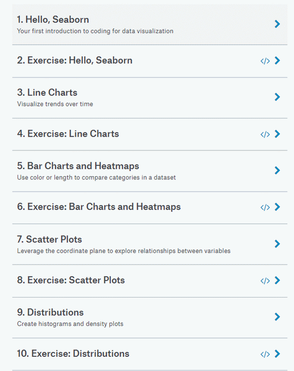
该课程包含 15 节课,分为课程讲解和练习两类,每一堂讲解课后都有一节练习课,让学员及时巩固和应用所学知识。
课程涉及对数据可视化工具 Seaborn 的介绍,如何绘制折线图、柱状图、热图、散点图、分布图,如何选择图表类型和自定义样式,课程期末项目,以及如何举一反三为自己的项目创建 notebook。课程目录如下所示:
下面,我们将选取其中一节课——散点图(Scatter Plots)进行简单介绍。
如何创建高级散点图
点进去你会在左侧看到这节课的大致内容,如下图所示,「散点图」共包含五个部分:

btw,眼尖的读者会发现,下面还有一个 comments 版块。所以,该课程还是交互式的呢,你可以边学习边评论。
通过这节课,你将学习如何创建高级的散点图。
设置 notebook
首先,我们要设置编码环境。
输入:
import pandas as pdimport matplotlib.pyplot as plt%matplotlib inlineimport seaborn as snsprint("Setup Complete")
输出:
Setup Complete
加载和检查数据
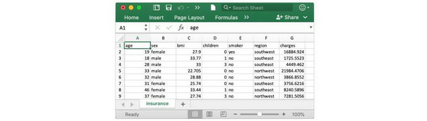
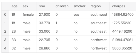
我们将使用一个保险费用(合成)数据集,目的是了解为什么有些客户需要比其他人支付得更多。数据集地址:https://www.kaggle.com/mirichoi0218/insurance/home
输入:
# Path of the file to readinsurance_filepath = "../input/insurance.csv"# Read the file into a variable insurance_datainsurance_data = pd.read_csv(insurance_filepath)
打印前五行,以检查数据集是否正确加载。
输入:
insurance_data.head()
输出:
散点图
为了创建简单的散点图,我们使用 sns.scatterplot 命令并指定以下值:
水平 x 轴(x=insurance_data['bmi'])
垂直 y 轴(y=insurance_data['charges'])
输入:
sns.scatterplot(x=insurance_data['bmi'], y=insurance_data['charges'])
输出:
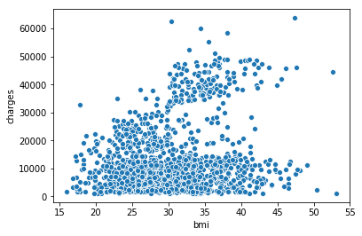
上面的散点图表明身体质量指数(BMI)和保险费用是正相关的,BMI 指数更高的客户通常需要支付更多的保险费用。(这也不难理解,高 BMI 指数通常意味着更高的慢性病风险。)
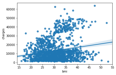
如果要再次检查这种关系的强度,你可能需要添加一条回归线,或者最拟合数据的线。我们通过将该命令更改为 sns.regplot 来实现这一点。
输入:
sns.regplot(x=insurance_data['bmi'], y=insurance_data['charges'])
输出:
/opt/conda/lib/python3.6/site-packages/scipy/stats/stats.py:1713: FutureWarning: Using a non-tuple sequence for multidimensional indexing is deprecated; use `arr[tuple(seq)]` instead of `arr[seq]`. In the future this will be interpreted as an array index, `arr[np.array(seq)]`, which will result either in an error or a different result. return np.add.reduce(sorted[indexer] * weights, axis=axis) / sumval
着色散点图
我们可以使用散点图展示三个变量之间的关系,实现方式就是给数据点着色。
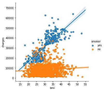
例如,为了了解吸烟对 BMI 和保险费用之间关系的影响,我们可以给数据点 'smoker' 进行着色编码,然后将'bmi'、'charges'作为坐标轴。
输入:
sns.scatterplot(x=insurance_data['bmi'], y=insurance_data['charges'], hue=insurance_data['smoker'])
输出:
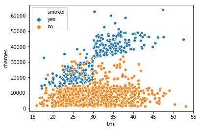
以上散点图展示了不抽烟的人随着 BMI 指数的增加保险费用会稍有增加,而抽烟的人的保险费用要增加得多得多。
要想进一步明确这一事实,我们可以使用 sns.lmplot 命令添加两个回归线,分别对应抽烟者和不抽烟者。(你会看到抽烟者的回归线更加陡峭。)
输入:
sns.lmplot(x="bmi", y="charges", hue="smoker", data=insurance_data)
输出:
/opt/conda/lib/python3.6/site-packages/scipy/stats/stats.py:1713: FutureWarning: Using a non-tuple sequence for multidimensional indexing is deprecated; use `arr[tuple(seq)]` instead of `arr[seq]`. In the future this will be interpreted as an array index, `arr[np.array(seq)]`, which will result either in an error or a different result. return np.add.reduce(sorted[indexer] * weights, axis=axis) / sumval
sns.lmplot 命令与其他命令有一些不同:
这里没有用 x=insurance_data['bmi'] 来选择 insurance_data 中的'bmi'列,而是设置 x="bmi"来指定列的名称。
类似地,y="charges" 和 hue="smoker"也包含列的名称。
我们使用 data=insurance_data 来指定数据集。
最后,还有一个图要学。我们通常使用散点图显示两个连续变量(如"bmi"和 "charges")之间的关系。但是,我们可以调整散点图的设计,来侧重某一个类别变量(如"smoker")。我们将这种图表类型称作类别散点图(categorical scatter plot),可使用 sns.swarmplot 命令构建。
输入:
sns.swarmplot(x=insurance_data['smoker'], y=insurance_data['charges'])
输出:
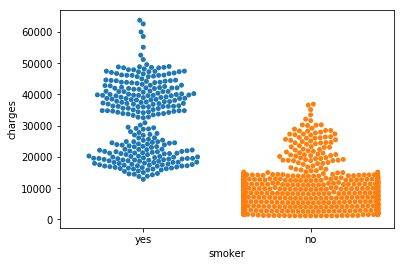
除此之外,这个图向我们展示了:
不抽烟的人比抽烟的人平均支付的保险费用更少;
支付最多保险费用的客户是抽烟的人,而支付最少的客户是不抽烟的人。

时间:2019-05-02 10:23 来源: 转发量:次
声明:本站部分作品是由网友自主投稿和发布、编辑整理上传,对此类作品本站仅提供交流平台,转载的目的在于传递更多信息及用于网络分享,并不代表本站赞同其观点和对其真实性负责,不为其版权负责。如果您发现网站上有侵犯您的知识产权的作品,请与我们取得联系,我们会及时修改或删除。
相关文章:
相关推荐:
网友评论: